Branding & Print Collateral – Seminar
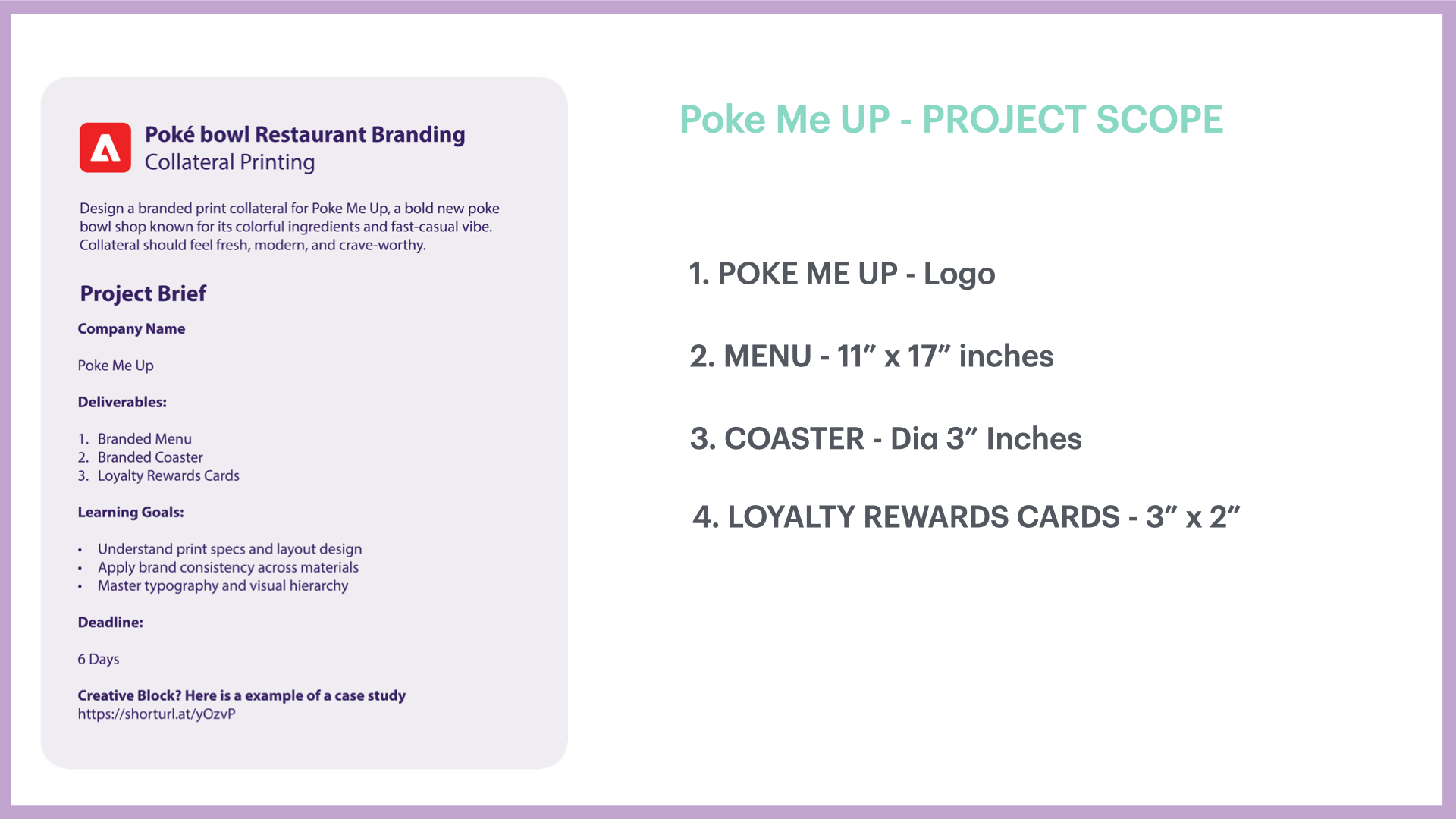
Overview: This project involved designing branded print collateral for Poke Me Up, a bold new poke bowl shop celebrated for its colorful ingredients and fast-casual energy. The goal was to capture the brand’s freshness, vibrancy, and crave-worthy appeal while creating materials that resonate with a youthful, food-loving audience.
Objective: Develop a suite of branded collateral that: Expresses the shop’s playful, modern identity. Highlights the colorful, fresh ingredients at the core of the brand. Appeals to a fast-casual dining audience. And, Maintains consistency across menus, flyers, and promotional handouts
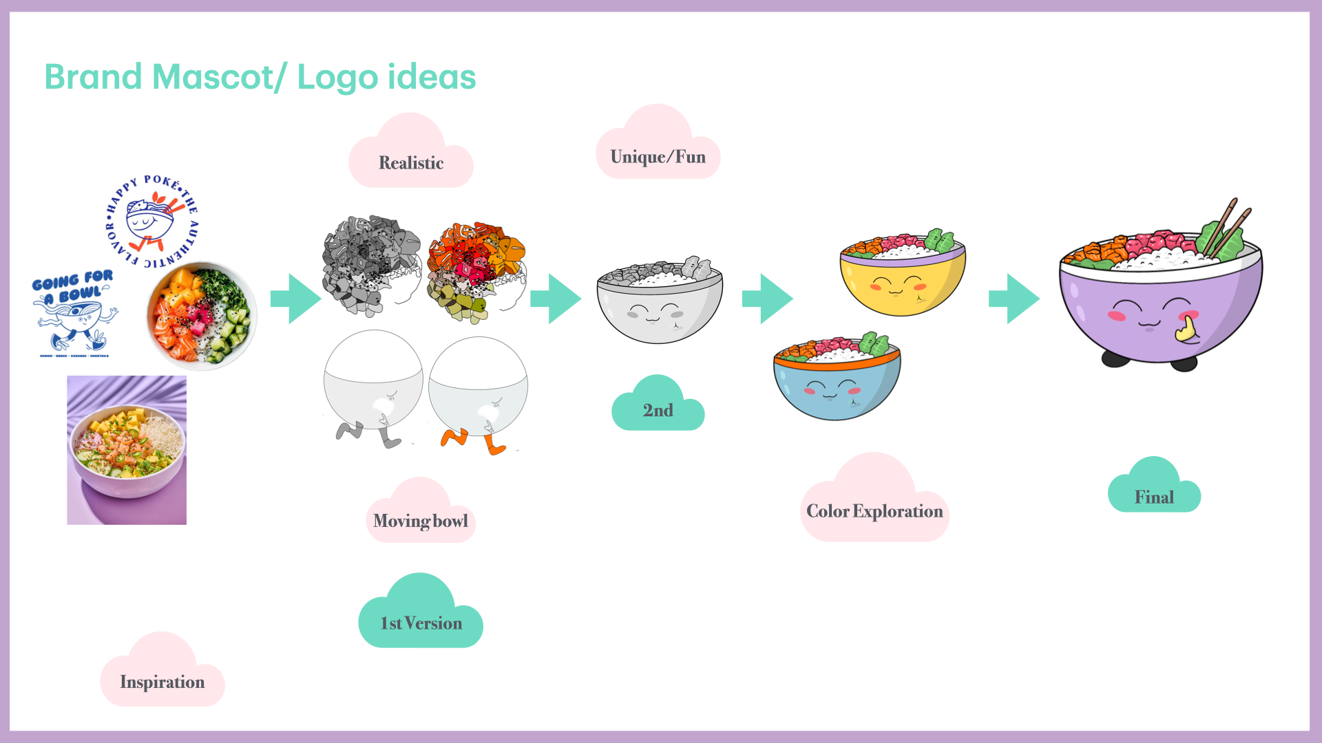
My Role: Brand Development | Layout Design | Typography Selection | Illustration & Iconography | Color Palette Development | Print Styling
I led the design process, ensuring that every visual element—from typography to illustration—reinforced the brand’s energetic and flavorful personality.
Tools Used: Adobe InDesign | Adobe Illustrator | Adobe Photoshop
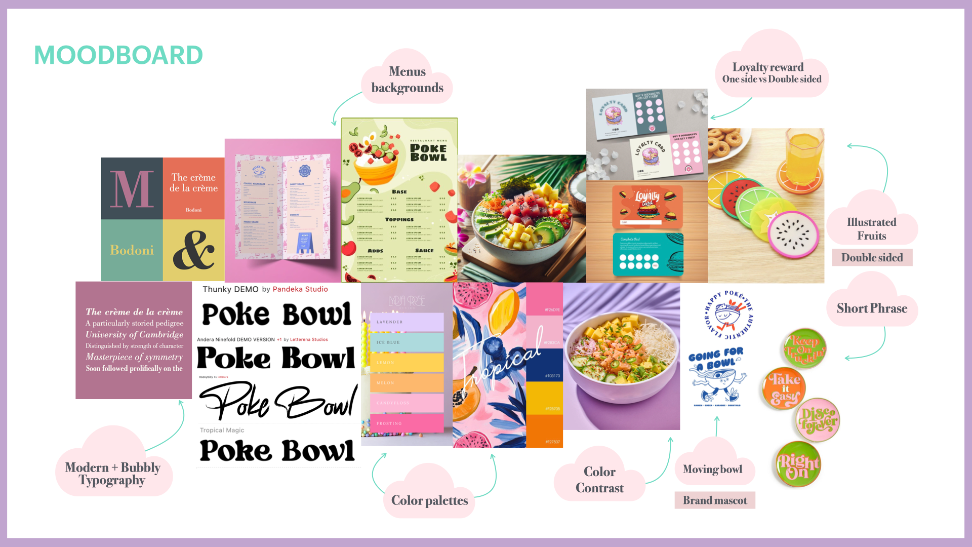
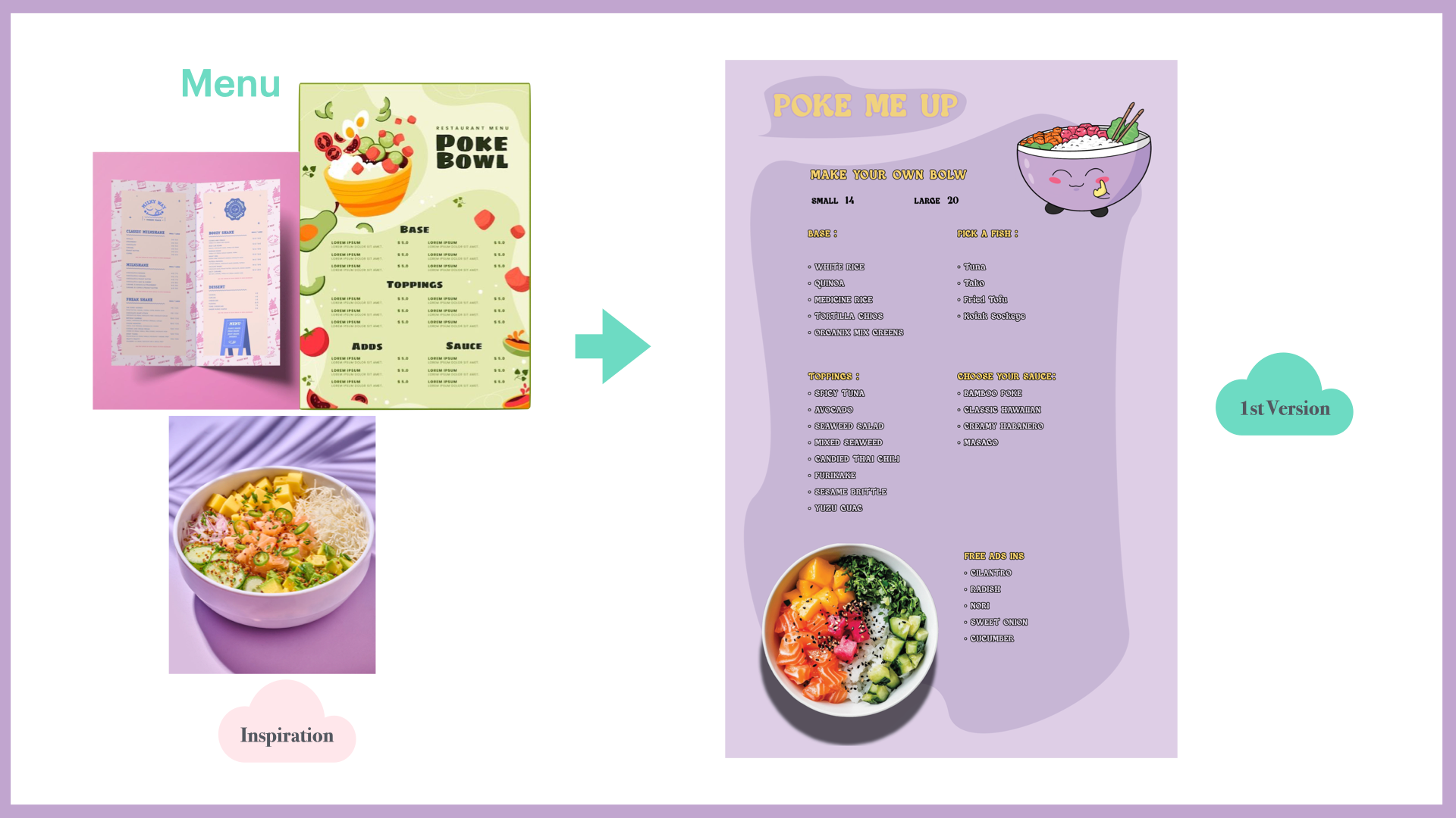
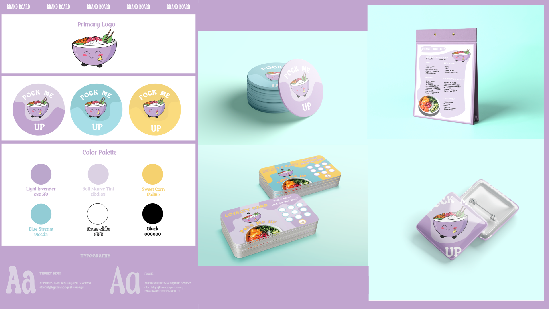
Design Approach: The design leaned on pastel lavender as the primary brand color, setting a tone that feels fresh, approachable, and modern. This soft yet distinctive hue provided a unifying thread across all collateral, while complementing the shop’s colorful food photography.Every decision was made to ensure the collateral felt fresh, modern, and crave-worthy, perfectly aligned with Poke Me Up’s bold yet welcoming identity.