Overview:
This project focused on creating a comprehensive brand identity for KyoviCare, a conceptual skincare brand rooted in values of purity, care, and confidence. The goal was to develop a logo and visual language that conveys calmness, trust, and modern simplicity—aligned with the brand’s focus on gentle, effective skincare.
Objective:
Design a versatile and recognizable logo for KyoviCare, supported by a full brand strategy guide that includes color systems, typography, logo variations, and usage rules. The visual system needed to be adaptable across packaging, digital, and print while remaining visually cohesive.
My Role: Market & Brand Research | Logo Conceptualization and Design | Brand Strategy & Style Guide Development | Case Study Presentation
I managed the full creative process—from initial sketches to final branding documents—ensuring the identity reflected KyoviCare’s intended tone and target audience.
Tools Used: Adobe Illustrator | Adobe InDesign | Adobe Photoshop | Keynote
Design Approach:
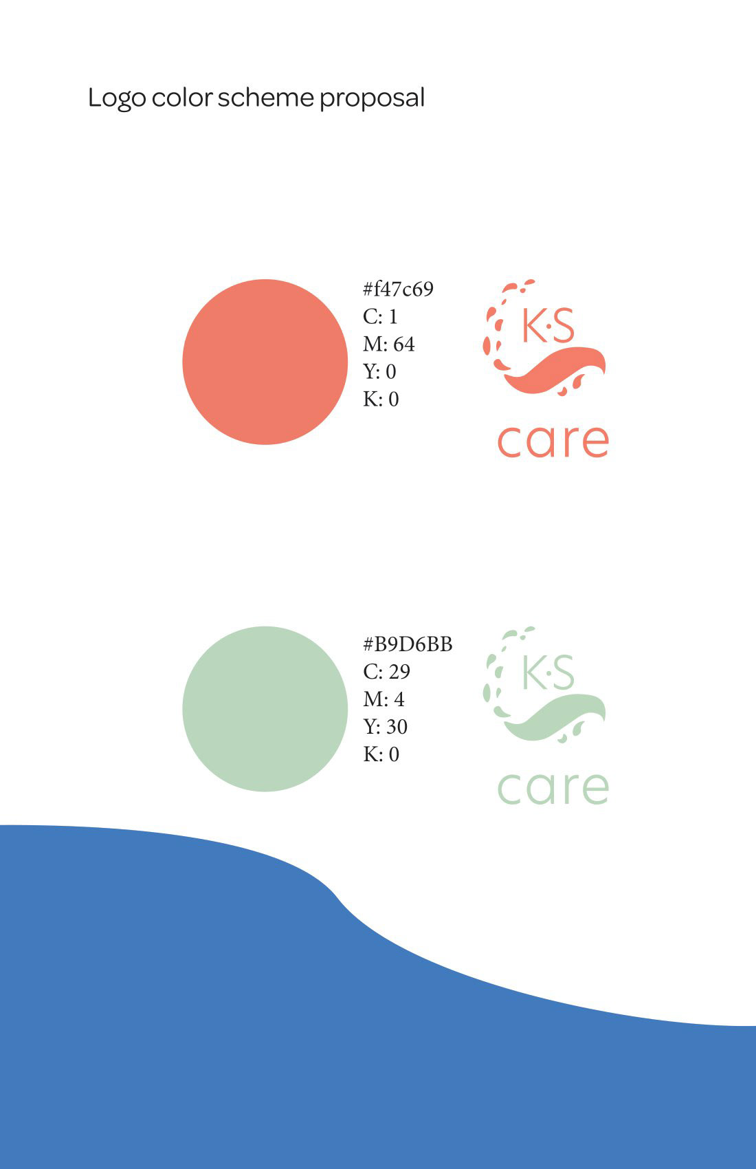
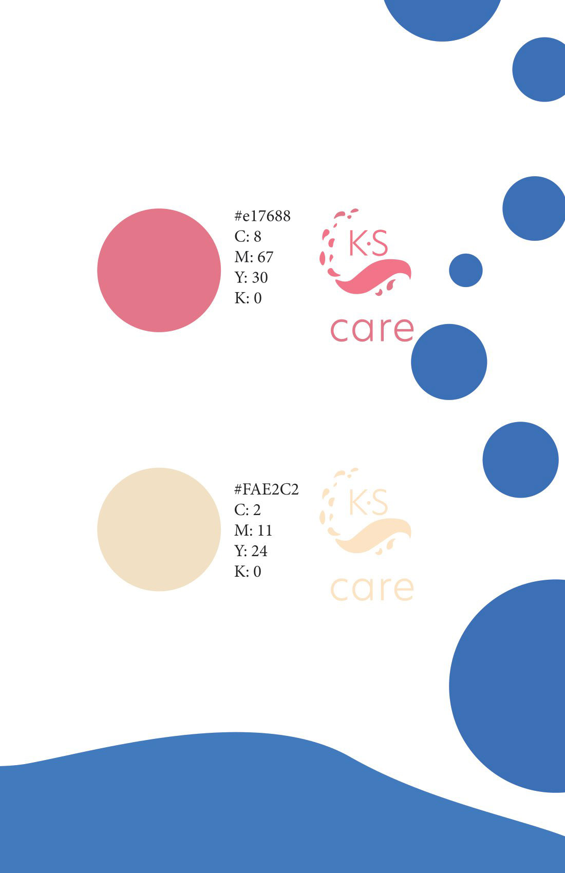
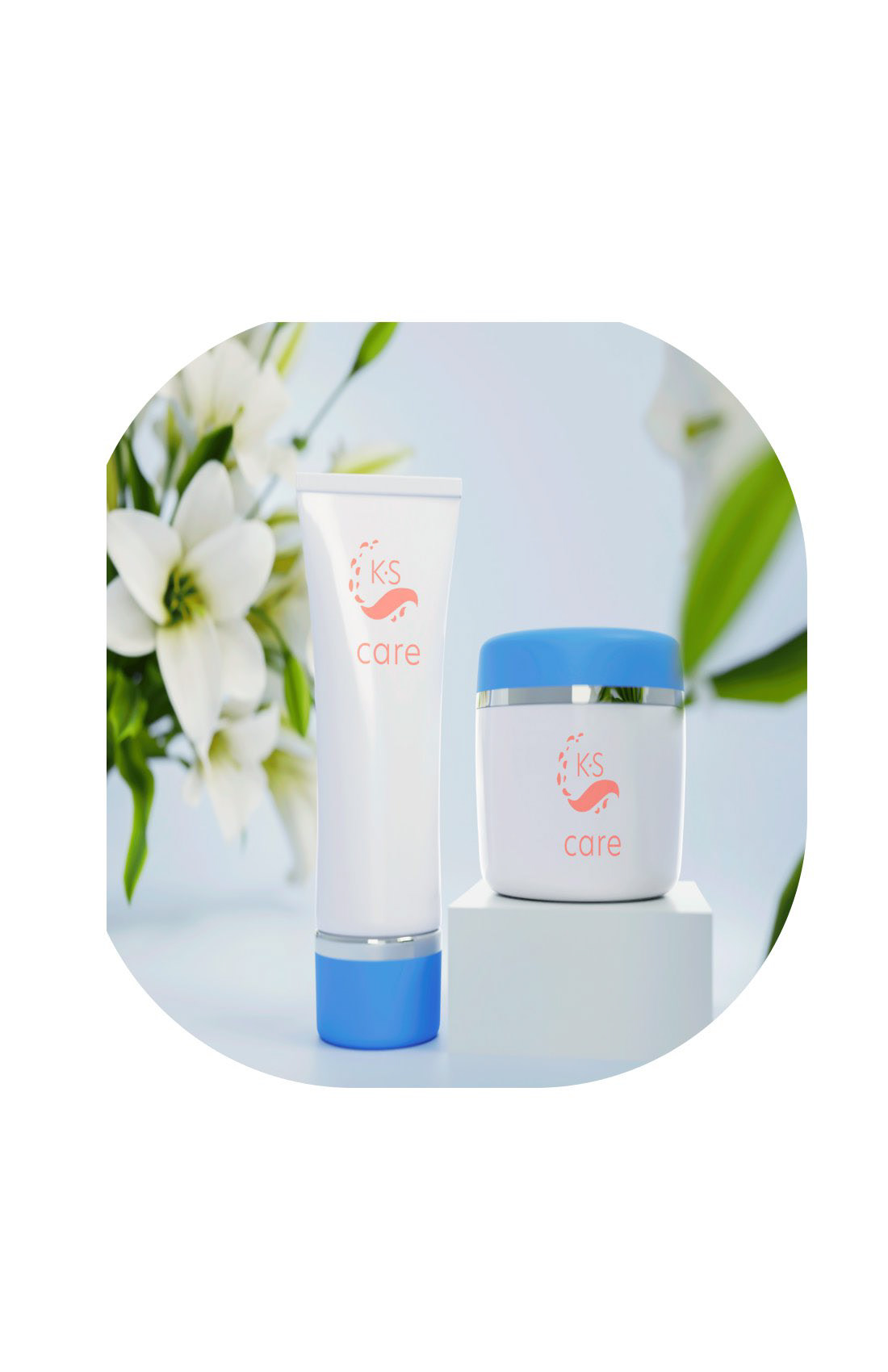
The logo design features clean, rounded forms and organic curves, evoking a sense of serenity and care. A soft pastel color palette—including hues of blush pink, muted sage, and cream—was chosen to reflect the brand’s gentle, skin-friendly ethos.
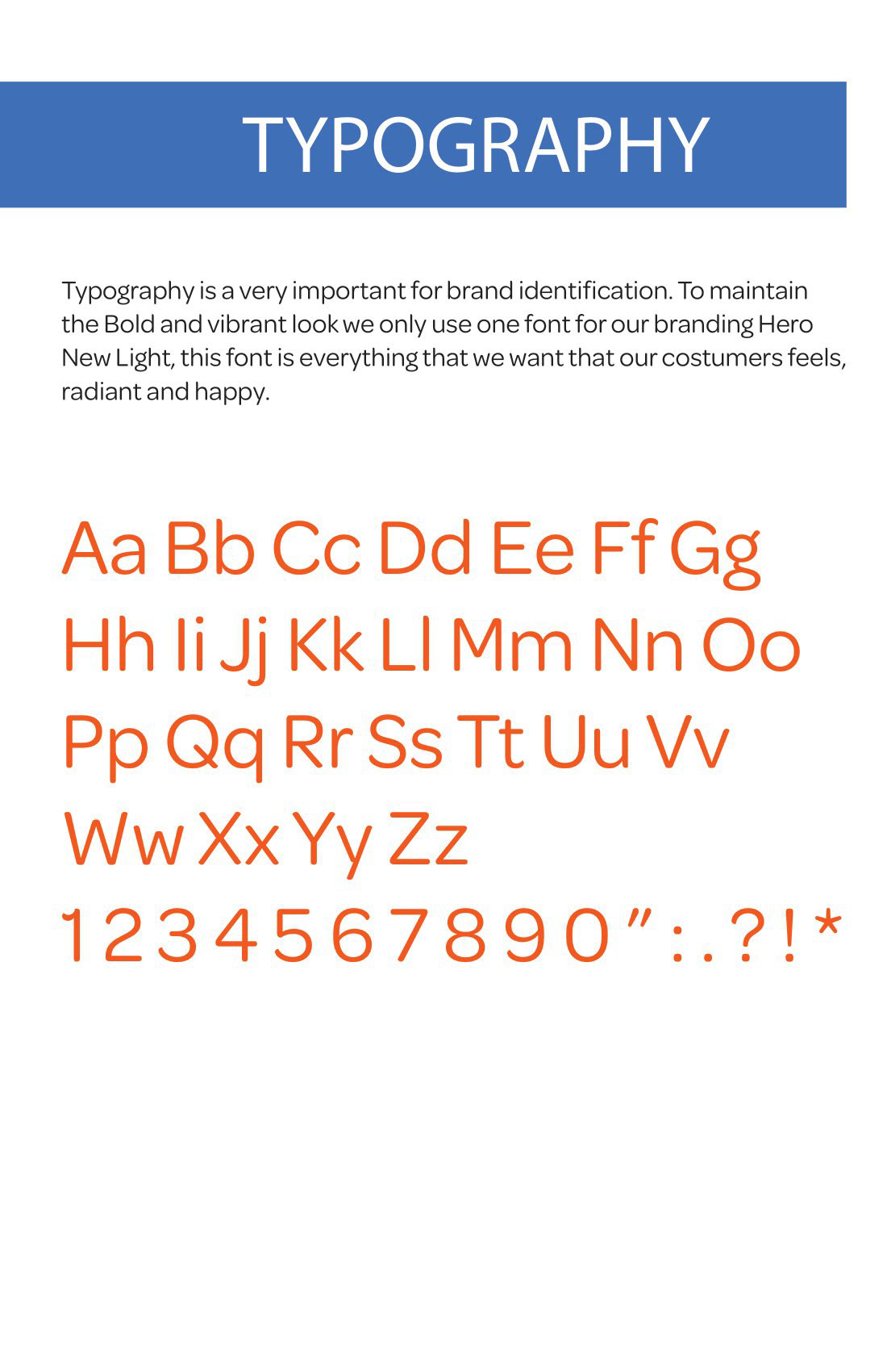
The brand strategy guide outlines: Primary & secondary logo uses | Brand color system & HEX codes | Typography hierarchy | Visual tone and imagery direction